“What will Pantone’s color of the year be for 2017?” That’s a question that’s been on the minds of art lovers, color enthusiasts, and generally curious people for the latter part of 2016. Pantone is really good at piquing people’s interest. The company has made an art form of suspense. The Pantone website states, “The Pantone Color Institute’s color forecasts provide a global point of view on the movement of color across current and future seasons.” Pantone keeps people all over the world updated on what’s trending in the world of color. Today we are going to discover what color this remarkable company chose to represent 2017.
Pantone’s Colors of the Year for 2016: “Serenity” and “Rose Quartz”
In 2016, Pantone did something unexpected by having two colors of the year: serenity (light blue) and rose quartz (dusty pink). According to Pantone, this color combination was “a color snapshot of what we see taking place in our culture that serves as an expression of mood and attitude.” The fact that Pantone chose two colors instead of one to represent 2016 surprised many people. Read more about Pantone’s colors of 2016 here.
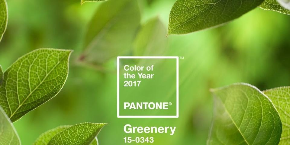
“Greenery” Is Pantone’s 2017 Color of Year

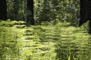
Image via pixabay.com
2017’s color of the year is nothing like the colors that represented 2016. Instead of sweet, soft, nursery colors, Pantone has chosen ‘greenery.’ “Greenery is a fresh and zesty yellow-green shade that evokes the first days of spring when nature’s greens revive, restore and renew,” states the Pantone website. It continues, “Greenery is nature’s neutral. The more submerged people are in modern life, the greater their innate craving to immerse themselves in the physical beauty and inherent unity of the natural world. This shift is reflected by the proliferation of all things expressive of Greenery in daily lives through urban planning, architecture, lifestyle and design choices globally. A constant on the periphery, Greenery is now being pulled to the forefront – it is an omnipresent hue around the world. A life-affirming shade, Greenery is also emblematic of the pursuit of personal passions and vitality.”
One question: why ‘greenery’? Why was this specific shade chosen as color of the year for 2017? It was chosen by Pantone because of what it represents, which is rebirth and regeneration. We, as well as our physical environments and society, could use a little rebirth and regeneration during these challenging times.
What do you think of ‘greenery’? As far as you can remember, what has been your favorite Pantone color of the year? Can you see yourself wearing greenery-colored clothing this year? Do you think ‘greenery’ was a good choice for 2017? Share with us in the section below.
Read More Segmation Blog Posts About Pantone:
What Is Pantone’s Color of the Year for 2016?
Be an Artist in 2 minutes with Segmation SegPlay® PC (see more details here)
SegPlay® Mobile available for Amazon Fire, iPhone, iPad, Android


