Have you noticed that certain colors are trendy? Some are ‘in’ while others are ‘out’. Many reincarnate as ‘vintage’ or ‘retro.” This brings up one question: what will the ‘It’ color be for 2015?
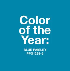
 According to the PPG Pittsburgh Paints® brand, it’s Blue Paisley—a decadent shade that is almost royal blue but retains an identity all its own. Experts at the company predict that Blue Paisley will feature prominently in home decor trends in 2015, when homeowners are expected to favor vibrant and expressive hues that inspire and represent their hopes and dreams.
Nowadays, homeowners are turning to multiple regions and influences for decor inspiration, seeking to change their home environments into a celebration of worldly possibilities. By choosing colors like Blue Paisley, which represent global diversity, they inject an exciting and worldly aura into their living spaces.
Blue Paisley is featured in one of four new color palettes developed by Pittsburgh Paints to showcase the anticipated 2015-16 color trends. The company’s national color marketing manager explained, “We are experiencing the popularity of the soft blue shade across all markets, such as home decor, automotive and electronics, making it a clear PPG Color of the Year selection.”
PPG’s creative team of color stylists from around the world worked together to conceive and develop the underlying idea and philosophy behind the four new palettes. Homeowners are encouraged to choose color combinations that are representative of their aspirations for the coming year. At their disposal are friendly and vibrant hues such as Jewel Weed, fiery and energetic colors like Firecracker, and cool, sophisticated tones such as Copper River.
The four new palettes are:
- Good Life: This fresh and earthy palette represents harmony. Organic sources, such as floral colors, earthy neutrals, and crisp sea blues inspired this palette’s variety of naturally bold hues.
- I’m Pulse: Bold, expressive, and artistic, “I’m Pulse” represents creativity. Color traces of classic, pop, abstract, and digital art are reflected in the intense yellows, hot blues, burnt pinks and sultry greens.
- Co-Leidescope: This trend, which represents possibilities, has a color scheme designed to be “ethnicity-inclusive, culture-inclusive and co-existence-inclusive”. Purple and green in deep jewel tones, spicy reds, and shining yellows reflect a global essence that will appeal to existing and aspiring jetsetters.
- Introsense: Like Co-Leidescope, this palette represents possibilities but takes a much softer approach with ‘zen neutrals’ such as gentle blues and indulgent pinks. Soft tints add a factor of serenity and sensitivity, resulting in minimalistic styling that blends clean designs with quiet nature.
PPG’s national color marketing manager added that the growth and strengthening of global connections has increased overall desire to adopt the unique features and colors of natural surroundings.
 “Whether it’s recognizing the contrasts of our manmade environment versus what nature provides as a way to identify the simple, earthen spirit through natural muted tones, or embracing the bold and expressive hues of a self-centric and artistic being, the desire to recognize the possibility of what’s ahead is appealing.”
Which of these four palettes do you prefer? Let us know by responding in the comment section below.
Read more Segmation blog posts about art and color:
The Colors of Fall: 5 Shades for a Stylish Season
What Color Should You Paint Your Home?
Be an Artist in 2 minutes with Segmation SegPlay® PC (see more details here)
Join us on FacebookSegPlay® Mobile iTunes now available for iPhone and iPad


I’ve always been partial to shades of blue (as long as they weren’t too far into the green). Historically, blue was expensive and difficult to work with , thus giving it its regal connotation. I appreciate the blues more because of that.
Oh Yee!!!
Oh Yee!!!
Anything but blue! All our homes are starting to look the same.